Egencia Icon Redesign
At Egencia, the design team has unique opportunities to own the decisions made within our global product spaces. Sometimes while working in our separate product areas, we recognize inconsistencies within our own design system. This is only natural when you are a dynamic, distributed, multi-faceted team, and lack a dedicated designer focused solely on your design libraries.
As everyone in the team is passionate about creating a top-notch design system, we decided it was time to collaborate on doing just that. Luckily, we are empowered to do so.

One such problem has been sticking around since 2015. A handful of designers had approached our icon library over the years with the goal of an overhaul, but the project was never fully completed. So, over time, the icon library grew and morphed into a disjointed and sometimes redundant set of icons with little unification or systems-thinking behind it.
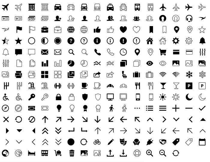
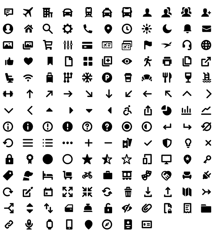
The aim of renewing this project was to bring the entire icon set onto the same level, creating a new and consistent system to use across our product ecosystem as a recognizable family.
Much like typeface design, icon design often gets overlooked. It’s easy to forget that humans design icons and that we can control their look and feel, making them into a unique brand asset. An icon family can have a similar impact as a font and can make a bold statement toward the brand personality.

We didn’t retain many of the old details in the new set. In essence, we threw out everything and started over. This presented us with a great opportunity as well as a great challenge. To tackle a set of over 220 icons, we came together to discuss what kind of character we wanted them to have. There are various ways to approach a challenge like this, and simply saying “Professional” or “Friendly” wasn’t quite enough.

Icon design is a great example of thinking about design systematically. For a set of 200 icons to feel like a cohesive family, they need to have consistent characteristics and similarities carried throughout each one. With the new icon set, we have 3–4 consistent design treatments that became visual rules to shape their actual design. As we got further into designing the set, it was natural for exceptions to these rules to pop up, and in those cases, we considered each exception within the context of the whole family.
We carefully considered attributes such as line weight, border-radius, and negative space in each glyph, as well as a few unique design treatments that carried across a handful of icons to make them ours.


After months of design review, hundreds of iterations, and countless examples of icon groups displayed in context, we landed on a finalized set that we were excited to use. There were many steps following our excitement, including mapping, implementation, and bringing all of our platforms onto the same page.
It is in our DNA to strive to give users the very best experience, and with our new set of icons, Egencia’s design library just got a step closer.

If you are a passionate Product Designer, with a desire to work on big-impact teams, reach out and let us know. We are always looking for top-level talent.
